JCI — Drone Innovation
UI/UX Design & Frontend Development
From Figma concepts and interactive prototypes to a responsive HTML, CSS, and JavaScript implementation for a modern aerial technology brand.
From Interface Design to Frontend Implementation
JCI Drone Innovation is a multi-page website concept created to present a modern drone brand and its digital ecosystem.
Building a Cohesive Aerial Tech Brand Experience
The project encapsulates a complete digital experience for a fictional high-performance drone manufacturer. Rather than stopping at static mockups, the design was translated into an interactive Figma prototype and subsequently engineered into a responsive multi-page web implementation using semantic HTML5, clean CSS3, and vanilla JavaScript.
The platform addresses key user touchpoints across the entire customer lifecycle: discovering advanced cinematography drones, exploring retail channels, engaging in community discussions, and reaching customer care.
Structured 5-Stage Design & Development Methodology
A structured progression ensuring design fidelity and seamless frontend translation.
DISCOVER
Analyzed the aerial technology brand identity, user personas (filmmakers, beginners, enterprise pilots), and core user journey goals.
DESIGN
Created responsive layout grids, high-contrast visual hierarchy, dark-accented hero headers, product cards, and forms in Figma.
PROTOTYPE
Connected screens into an interactive prototype to validate navigation flows, tab switching, and mobile app presentation.
DEVELOP
Implemented semantic HTML5 structures, centralized CSS3 variables, Grid/Flexbox layouts, and vanilla JavaScript handlers.
REFINE
Tested cross-browser responsiveness, spacing balance, image scaling, form input states, and touch-friendly mobile navigation.
Comprehensive Multi-Page Interface Showcase
High-resolution visual execution across all core destinations in the JCI digital ecosystem.
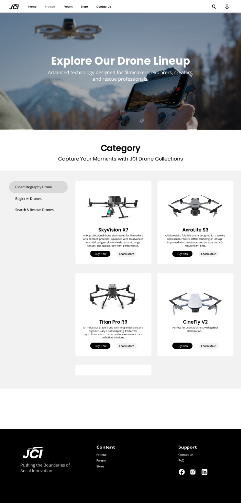
Product Catalog
Product catalog — categorized drone discovery and card specifications
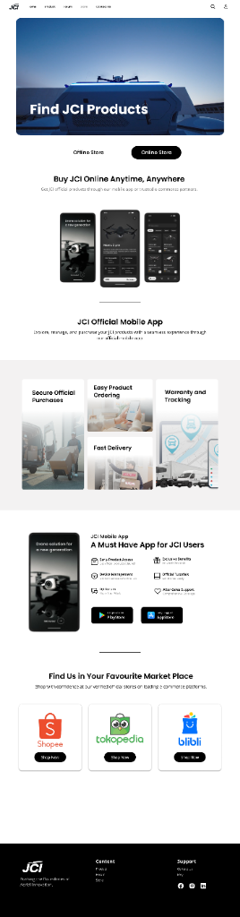
Online Store & Mobile App
Store experience — digital purchasing channels and mobile app showcase
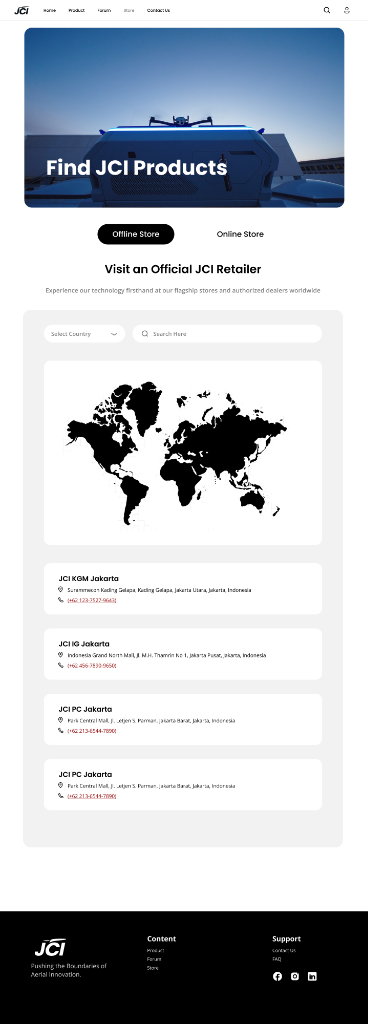
Offline Store & Retailers
Offline Store — authorized flagship retailers and regional directory
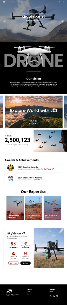
Home & Brand Vision
Home page — dynamic hero carousel, brand narrative, and innovation achievements
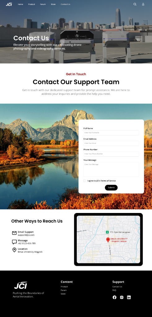
Contact & Support
Contact — customer support inquiry form and physical campus location
Multi-Page Website Structure & Navigation Flow
A logical hierarchy connecting high-impact brand storytelling with clear transactional and community pathways.
Product Catalog
- Cinematography Drones
- Beginner Drones
- Search & Rescue Drones
- Specification Cards
Store Experience
- Online Store & Mobile App
- Marketplace Hubs
- Offline Flagship Directory
- Global Retail Map
Community Forum
- Category Discussions
- Hot & Popular Topics
- Search & Tagging
- Create Post Action
Contact & Support
- Inquiry Submission Form
- TOS Acknowledgement
- Google Maps Embed
- Direct Communication
Deep Dive into Core User Touchpoints
Detailed examination of the four foundational feature destinations across the JCI digital platform.
BLOCK 01Structured Drone Catalog & Specifications
The Product experience organizes JCI’s drone lineup into clear categories, allowing users to explore different drone types and compare products through consistent product cards.
BLOCK 02Dual Retail & Official Mobile Ecosystem
The Store experience connects customers with both online and offline purchasing channels, blending app convenience with retail accessibility.
BLOCK 03Pilot Discussions, Tutorials & Announcements
The Forum page introduces a community-driven experience where users can discover discussions, tutorials, announcements, and popular topics.
BLOCK 04Accessible Inquiry Channels & Campus Map
The Contact experience provides a direct support channel through a structured contact form and location information.
Design Rationale & Usability Strategies
Intentional design principles engineered to reduce cognitive friction and heighten product desirability.
Clear Global Navigation
The persistent sticky navbar consistently exposes all 5 core sections (Home, Product, Forum, Store, Contact Us), ensuring pilots never lose their position within the multi-page journey.
Visual-First Product Discovery
Drone photography and product cards prioritize high-resolution transparency cutouts and bold specs over dense text, enabling quick visual comparison across price points.
Separated Purchase Paths
By dividing the Store into distinct Online (App/Marketplaces) and Offline (Retail Locator) tabs, the UI prevents confusion between instant digital ordering and physical test-flight visits.
Community + Support Separation
Decoupling peer-to-peer discussions (Forum) from formal customer inquiries (Contact) maintains a clean, searchable knowledge hub while offering private assistance channels.
Consistent Black, White & Red Identity
A unified dark/light contrast palette anchored with crimson red accents reinforces the premium engineering ethos of the JCI brand across every page.
Design Tokens & Component Architecture
The exact design system rules and CSS variables established in the project codebase.
Geometric, modern, and highly legible across display headings, spec sheets, and body copy.
1400px max-width container, 12-column responsive grid patterns, and sticky header positioning.
Frontend Architecture & Code Translation
The final interface was translated from the Figma design into a static multi-page website using semantic HTML, centralized CSS styling, and lightweight JavaScript interactions.
Semantic Document Structure
Each page (home2.html, product.html, store.html, forum.html, contact.html) was authored using clean semantic tags: <header>, <nav>, <section>,<article>, and <footer>.
- Accessible anchor link hierarchy
- Search & profile modal triggers
- Proper form labels and required input validations
Centralized Styling & Variables
A single unified styles.css stylesheet utilizes CSS Custom Properties (--primary-color, --accent-color) and modern CSS Grid / Flexbox for layout consistency.
- Responsive media queries (1024px, 768px, 480px)
- Hover transitions, elevation shadows, and button states
- Seamless overlay headers for full-bleed hero banners
Lightweight UI Interactions
Modular vanilla JavaScript in script.js drives interactive state transitions without external heavy frameworks.
- Auto-rotating & draggable hero carousel slider with interval timer
- Online vs. Offline store tab switching
- Mobile hamburger menu open/close toggling
Adaptive Layouts Across Device Viewports
The website was engineered to gracefully adapt from wide desktop monitors down to mobile handsets.
Desktop (1024px+)
Full 1400px container width, multi-column product grids (4 columns), horizontal global navigation, and split-column contact layouts.
Tablet (768px – 1023px)
2-column adaptive product cards, stacked store promotional banners, flexible form layouts, and condensed map views.
Mobile (<768px)
Hamburger navigation drawer, single-column full-width product and forum cards, touch-friendly tap targets, and streamlined typography.
Tools & Technologies Used
Clean, standard-compliant frontend technologies utilized to design, prototype, and build the project.
Figma
Wireframing, UI component design system, color styles, and interactive prototyping.
HTML5
Semantic page structure, form elements, accessible link trees, and metadata.
CSS3
CSS variables, Flexbox, CSS Grid, media queries, keyframe transitions, and custom cards.
Vanilla JavaScript
DOM manipulation, carousel auto-play, tab toggling, and mobile navigation states.
Google Fonts (Poppins)
Clean modern sans-serif typography across headings, spec tables, and buttons.
Google Maps Embed
Interactive iframe map integration displaying the Binus University Anggrek location.
Individual Engineering & Design Contributions
Core areas architected, designed, and developed throughout this project.
UI/UX Design
Designed the complete website visual identity, interface layouts, and high-contrast typography hierarchy in Figma.
User Flow Architecture
Structured the multi-page navigation and user journey across Product, Forum, Store (Online/Offline), and Contact.
Interactive Prototype
Created the interactive Figma prototype to validate screen transitions, app promotions, and mobile flow logic.
Frontend Development
Implemented the approved multi-page interface using semantic HTML5, centralized CSS3, and vanilla JavaScript.
Responsive Implementation
Engineered responsive CSS Grid and media queries ensuring flawless presentation across mobile, tablet, and desktop.
UI Consistency
Maintained reusable styling patterns, CSS variables, buttons, cards, and navigation components across all 5 pages.
Technical & Design Challenges Solved
Key friction points encountered during development and the engineering solutions implemented.
Multi-Page Visual Consistency
Problem: Maintaining consistent spacing, header overlays, and colors across 5 standalone HTML files.
Solution: Established centralized CSS variables in styles.css and modular class naming conventions for cards, buttons, and navbars.
Full-Bleed Hero Banners with Responsive Text
Problem: High-impact hero imagery required transparent navigation overlays without breaking mobile layout stacking.
Solution: Applied CSS object-fit: cover, responsive padding clamping, and media-query position resets.
Figma to Code Layout Fidelity
Problem: Preserving pixel-accurate Figma component alignment when translated to fluid browser viewports.
Solution: Deconstructed designs into reusable CSS Grid templates and auto-fit flex layouts before authoring markup.
Content Readability in Dense Specs
Problem: Presenting extensive technical specifications and marketplace links without visual clutter.
Solution: Utilized whitespace, subtle border dividers, tabbed switches, and structured card components.
Project Summary & Deliverables
“JCI demonstrates a complete design-to-code workflow, combining UI/UX design, interactive prototyping, responsive frontend development, and multi-page information architecture.”
Cohesive Visual System
A unified brand identity, high-contrast dark/light contrast, and responsive layout system in Figma.
Interactive User Flows
Fully functional Figma prototype validating screen transitions, app promotions, and inquiry journeys.
Working Multi-Page Codebase
Clean, semantic HTML5, centralized CSS3, and vanilla JavaScript implementation ready for deployment.
Explore the Original Design & Prototype
Inspect the complete Figma design canvas, wireframes, and interactive prototype flows.
Inspect the JCI Drone Website Source Code
Explore the complete HTML5 markup, centralized CSS3 stylesheet, and JavaScript interaction code on GitHub.